
When a logo becomes language
Loewe’s anagram has crossed the line from brand mark to visual language.

When you don’t take yourself too seriously, your brand logo can show up in unexpected places, which actually makes it stand out even more.
I saw this tee and I loved the simplicity of it but also how instantly recognisable the logo was. Then it made me feel like while Loewe is a premium brand with high priced products, it felt instantly more personable, friendly and accessible. Even more relaxed and less stuffy.
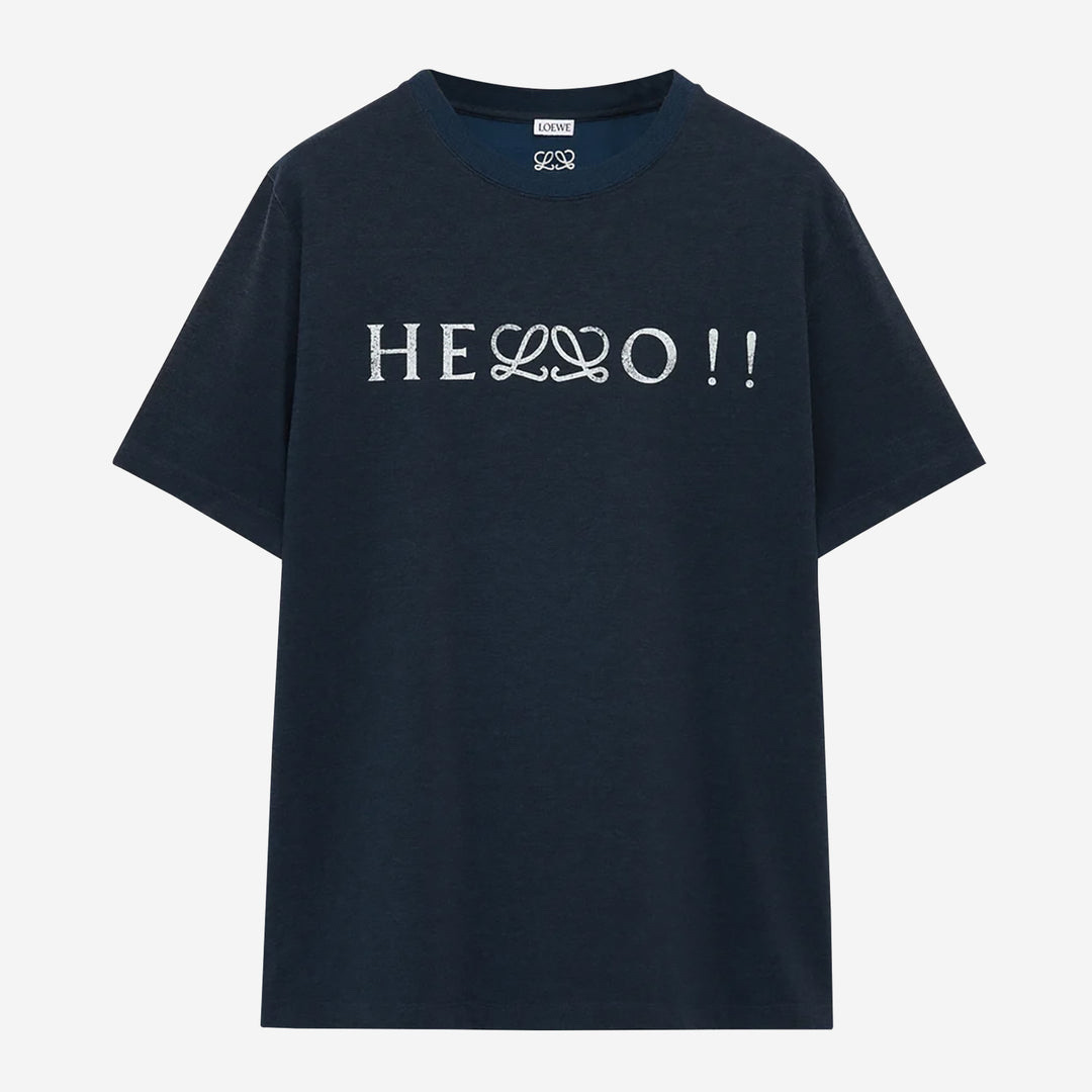
Loewe is no longer asking its logo to stand alone as a badge of luxury. It is letting it behave like a typographic character. A glyph. A piece of visual grammar that can slot into words, jokes, and ideas.
It’s what relaxed branding looks like in practice.
The logo does not announce the brand. It rewards recognition. If you know, you know. If you don’t, it still works as design. The shirt functions even if you miss the reference entirely.
That is cultural confidence and cultural capital.


Over-asserted logos need isolation and scale. They must be legible from across the room. Relaxed logos can hide in plain sight. They can interrupt words, sit inside seams, appear on linings, or replace a single letter without breaking the object.
Here, the anagram is doing something more powerful than signalling status. It’s a part of the fun.
When recognition is assured, the logo no longer needs a fixed position.
It becomes part of the culture around it.